Photography means different things to different people. It’s a way to capture a moment or record a memory. It can be functional or artistic. People take pictures to render a scene with a literal perspective or as a medium to translate an abstract concept or feeling.
The reasons I take pictures have changed over time, and my approach over the years shifted as my technical knowledge developed. A few years ago something happened to me totally out of the blue: I became completely bored with color photography. I was just done with it. I know it’s strange to become fed up with a whole palette, but it happened nonetheless. As a result I’ve shot black-and-white images almost exclusively for the past few years, and I’ve loved it. I have spoken to photographer friends, read articles, and written many words to try and gain some insight; I eventually realized that my underlying reason for taking pictures had changed. The narrative I intended for my work had shifted. My subjects didn’t change, but how I looked at them, lit them and developed them in Adobe Lightroom did.
The Goal of Experience and Feeling
As any photographer attempts to do, I hope to create images that are compelling and thought-provoking. I want to create pictures that stick with people, and I believe the best way to achieve that is not to simply present an image of a cool fish but to create a feeling about that fish. My goal is to create work that doesn’t show a thing but instead provides a sensation, mood or feeling or leaves an impression relative to that thing. To say it another way, I want my images to translate an experience, not just be a literal visual.
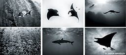
When I take pictures in color, the images tend to be about color, at least to some degree. Color has to work to be part of the frame — it has to grab and contrast, and we photographers tend to want to saturate it, emphasize it and show it in some spectacular fashion. Very little of what I see and experience in the ocean, however, has anything to do with color. For example, one of my favorite things to encounter in the ocean is a giant school of fish. I get mesmerized when I see hundreds or thousands of fish rhythmically and cooperatively moving together through the water. There’s something melodic about it; it feels like an organism that’s exhibiting a choreography that no solitary animal could possibly display. A lot of the ocean gives me this feeling of many things being together harmoniously, which is an experience that has nothing to do with color. To me, color even distracts from it.
The Practice of Experience and Feeling
Visualization is the practice of forming mental images of a finished photograph before a frame is ever composed. It’s an extremely helpful way for photographers to conceptualize what they are trying to do.
When visualizing black-and-white images during a dive, my frame of mind is vastly different than if I were visualizing in color. By removing color from my thoughts, I’m left with things that are closer to what I’m experiencing. I begin to look at shapes and forms, light and tonality, patterns and textures, details and outlines. By removing color I can escape the idea of wanting to take a picture of the fish and pursue the concept of capturing my experience of the fish.
Visualizing in black and white also changes my technical approach. How and why I light things changes from concerns about backscatter and strobe placement to aesthetics. If my goal is to emphasize a shape, I know to backlight it. If I want to create a texture, I know to sidelight. Or I can deemphasize shapes and flatten a subject or scene by frontlighting. Whatever the case, I connect more with black and white because my mind is in tune to all the things I experience with a school of fish that have nothing to do with color. The following are a few exercises that may help you refine your personal vision in black and white.
Try using grain or noise as an aesthetic. You’ll likely have to increase your ISO to capture a scene without strobes, but don’t fear that, as the presence of noise can be aesthetically pleasing. In fact, in the Effects panel in Lightroom’s Develop module, there is a Grain slider that allows you to add grain to your images. Increase that ISO, jump into those natural monochromatic tones around you, and play. Modern cameras are far more efficient in low light anyway, so higher ISO values should not necessarily intimidate you.
Consider the background to be as important as the primary subject. When color is removed you have to rely on distinguishing the subject from the background by other means. To start, try finding and incorporating simple, clean, uncomplicated backgrounds that contain a solid shade of either white, gray or black. Or use simple gradations from dark to light, but make sure your subject is set in front of a background tone from which it can be clearly distinguished.
Techniques for Image Processing
If you’re a Lightroom user, converting to black and white is easy. Although there are a couple of ways to turn your image black and white in Lightroom, I suggest going straight to the B&W panel in the Develop module. Simply click B&W, and your image is converted. The trick is in stylizing what you’ve captured. Here are a few styles to try for your monochromatic workflow.
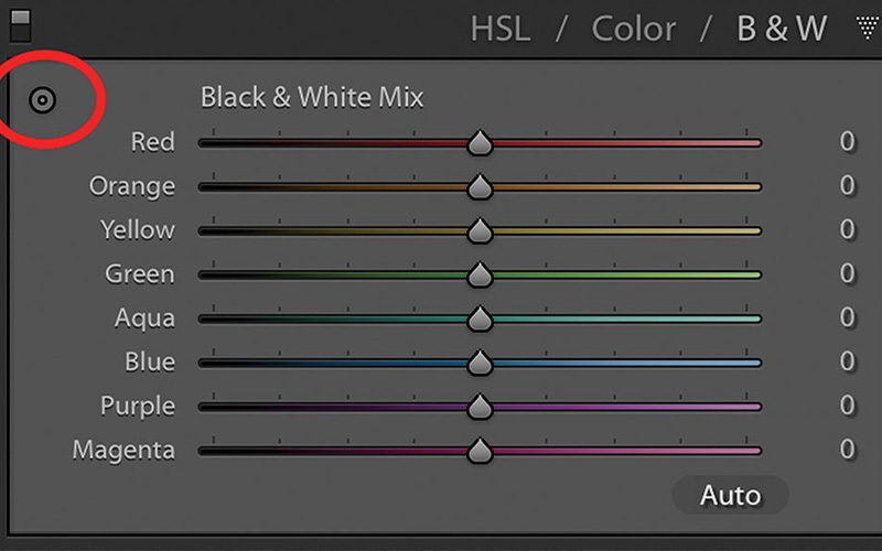
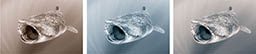
High-key and low-key. A high-key image is inherently bright in tone, while a low-key image is inherently dark in tone. With many blue-water images, creating either look can be achieved with a simple wave of the mouse. In Figure 1, notice the small icon in the upper left of the panel. This is called the Targeted Adjustment tool (TAT), and if you click on it, your cursor turns into a crosshair. With this crosshair you can click and drag your mouse on any color in your image that you want to adjust. Click and drag upward for one effect, and drag downward for another.

To create a high-key image, click and drag your mouse upward. Notice as you do that the blue slider in the B&W panel moves to the right, and all the blue tones are brightened, as shown in Figure 2. To create the opposite effect, or a low-key image, you’ll want to click and drag the mouse downward. Note that it’s rare to have an image that can work as either a high-key or a low-key image. They usually work as one or the other; experiment to figure out which. Moving just the blue slider left or right will likely be the first in a series of steps to develop the image’s final look.
In Figure 2, starting with the image on the far left, we have our original color image followed by the unaltered black and white. The third image moves the Blue slider to the left, thereby darkening the blues, and the fourth image moves the slider to the right, lightening the blues.
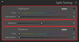
Color toning. In addition to the straight black-and-white look, you can also tone images. To tone your black-and-white images, look no further than the Split Toning panel. There are three sections to this panel, as shown in Figure 3. You can control the hue and saturation of your highlights and shadows, or you can shift the balance of the two to favor one or the other. My personal preference is to warm-tone images, which imparts a sepia feel. I especially like this look for printing, but Figure 4 shows three different ways you can tone your work. The first image is warm toned, the second cool toned, and the third is split toned.
To create a warm tone, I suggest setting your Hue slider in Highlights and Shadows to 35, and then slowly moving the Saturation slider to the right to taste. Feel free to adjust the Hue slider in either direction to fine tune it to precisely what you like, but I’ve found 35 to be a good number for warmth. Cool toning an image is similar to warming; just begin with your Hue slider at 220. To split tone, try splitting the difference, but play and experiment as you go. You can set your Highlights to 220 and your Shadows to 35, or visa versa. Whichever direction you choose, toning can help create just the feel or style you’re looking for.
Treat my suggestions as starting points for a process that will take you toward a photographic style that only you can discover. Whether you simplify your camera gear and dive without strobes, focus on uncomplicated backgrounds or shift your approach from photographing creatures to focusing on patterns, shapes, textures, tones and moods, the trick for finding what you like is to continue to experiment and be playful with your photography.
Explore More
Watch Jason Bradley discuss Processing Underwater Photos in this video.
© Alert Diver — Q4 Fall 2016